The Psychology of Colors in Marketing: How They Influence What We Buy

Looking for the right colors for your brand? Colors can have a profound effect on consumers. In this article, we’ll share the psychology of colors and how they influence what we buy.
A lot of people don’t notice it, but colors have a major impact on their purchasing decisions.
Humans are visual beings who process imagery much faster than plain text or audio content. Marketers are well aware of this fact, so they use all sorts of psychological tricks to maximize the attractiveness of their brands.
If you don’t believe us, take a look at these stats that prove the power of colors in marketing:
- Colors are the number one influencing factor in purchases for almost 93% of people.
- 40% of people will respond better to visual information than plain text.
- 80% of consumers think color enhances brand recognition.
- Almost 40% of website visitors stop engaging if images don’t load.
- Consistent presentation of a brand increases revenue by 23% on average.
This is only a small selection of the most impressive statistical findings, but it should be enough to convince you to pay attention to colors while shopping
Color psychology is a fairly complex field of research–an art and a science–so we want to explain the concept of color psychology and present you the fundamental findings in our post.
Are you ready to learn how to use color psychology in your marketing?
Great! Let’s take a closer look at how colors influence our decisions…
Psychology of Colors: Definition and Theory
Before we delve deeper into the meanings and connotations, we need to understand the theoretical background of color psychology.
So what is color psychology anyway?
Color Psychology Definition
Color psychology is the study of hues as a determinant of human behavior.
According to this theoretical concept, colors have a deeper impact on human behavior than most people believe, influencing even the smallest details such as our daily moods or food preferences.
This is exactly why marketers exploit the psychology of colors – they want to raise brand awareness and inspire consumers to take the desired action.
A color wheel is the first lesson marketers have to learn when analyzing visual elements. It’s a basic model that combines different colors and helps designers to find perfect combinations.
Why is this important? Well, before we can even begin to influence people with color psychology, we need to first understand how to combine colors in a way that is pleasing to the eye. After all, if your colors are ugly or jarring next to each other, or if they make your message illegible, you’ll certainly fail to persuade anyone to do business with you.
So how do you create an aesthetically pleasing color combination?
Well, traditionally, colors on the opposite sides of the color wheel are considered to be a good match, thus creating color harmony. In this case, ideal color pairs are red and green, blue and orange, yellow and purple, etc.
The standard RYB (red, yellow, blue) model divides colors into three distinctive groups:
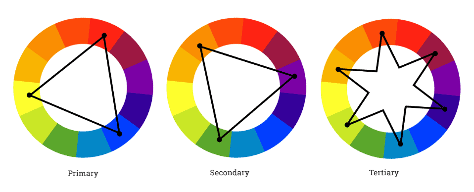
- Primary: The RYB acronym comes from the first letters of the three primary colors: red, yellow, and blue.
- Secondary: Green, orange, and purple are considered to be secondary colors in the RYB format.
- Tertiary: All the other colors (the so-called tertiary colors) are basically a combination of primary and secondary colors.
Another way to distinguish between colors is by thinking in terms of warm and cold colors.
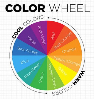
Warm and cool color wheel (Source: Decoart)
Each one of these groups influences people’s perception and energy levels, but we will cover this segment more comprehensively in the next section of this guide.
Besides that, you must keep an eye on color harmonies. There are all sorts of combinations out there, but most designers, marketers, and brands use one of the following schemes:
- Complementary: We mentioned this color scheme already – it’s the one that pairs colors from the opposite sides of the color spectrum.
- Analog: This color scheme is known for combining the neighboring elements from the wheel. In this case, red and orange make the best combination, as well as blue and green or blue and purple.
- Triadic: Designers who want to combine more than a couple of colors often choose a triadic color scheme. It’s a combination of three colors that are evenly distributed around the color wheel.
The Meaning of Colors in Marketing Psychology
A beginner-level marketer might think it’s funny to say that colors have meanings, but it’s actually a well-known truth. Each color brings unique connotations and ambiance, which gives a very special effect when combined with the overall brand appearance.
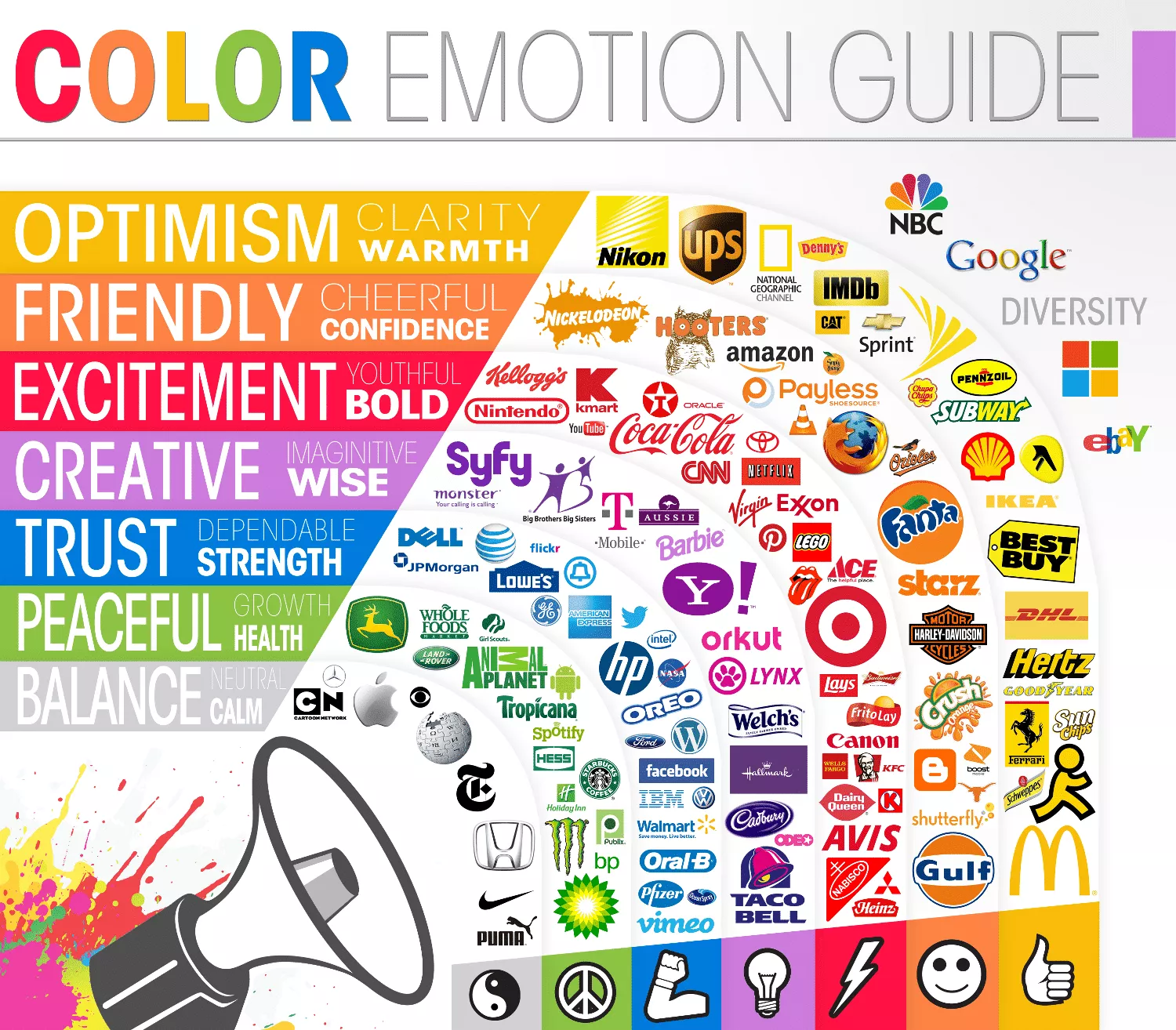
Famous brand logos and color emotion guide (Source: The Logo Company)
While there are no hard and fast rules here, it is inescapable that societies and cultures have specific associations with colors. For example, in the U.S., the color commonly associated with baby boys is pastel blue, and the color associated with baby girls is pastel pink.
For the purpose of this article, we will describe the common psychology that hides behind each one of the frequently used colors.
Here they are:
- White: The color of perfection, white represents innocence, purity, and wholeness. It can suggest a new beginning, mindfulness, and neutrality. It doesn’t evoke strong emotions, but rather suggests that the brand is well-balanced, clean, and serene. This is why a lot of cosmetics brands use white as the symbol of freshness and purity, while you can also find it on cleaning products.
- Yellow: If there is one color that screams emotions, it must be yellow. It reveals optimism and high energy levels, so everyone has to pay attention to yellow-based branding. This color proved to encourage mental processes and the nervous system in its entirety, which is why it is also considered an excellent communication booster. DHL, IKEA, and Shell are some of the most famous companies that use this color for branding purposes.
- Orange: Orange is a very warm color that displays excitement, happiness, and enthusiasm. However, marketers usually use it to highlight important elements such as calls to action, a tactic that works well with impulsive buyers. Firefox and Amazon are standout representatives of orange-based branding.
- Red: This must be one of the most commonly used colors in the history of marketing. Red shows intense and strong emotional reactions, symbolizing the feelings of love and passion. It increases a customer’s heart rate and encourages appetite, which is why so many restaurants use red hues. The list of brands using red is long and distinguished: from McDonald’s and Target to Coca Cola and CNN.
- Green: White may be the color of purity, but green is definitely the color of nature and tranquility. It chases off depression and symbolizes a new beginning. As such, it’s not a surprise to learn that brands use green to represent environmentally-friendly projects. Some examples include Animal Planet, Starbucks, and Tropicana.
- Blue: Together with red, a color blue is certainly the most popular choice among marketers. It symbolizes calmness, rational decision-making, trust, and credibility. Marketers love blue because it displays professional authority, which boosts customer loyalty. Naturally, a lot of big brands rely on blue: JP Morgan, Facebook, LinkedIn, Ford, and many others.
- Purple: Purple has a royal character, revealing well-off individuals and exclusive brands. Companies selling high-end products tend to use purple to emphasize the premium notion of their brands. Representative brands include Rolex, Crown Royal, and Hallmark.
- Black: A lot like purple, black is the color that displays power and luxuriousness. It’s a frequent branding solution because you can combine black with every other color from the wheel. Many high-end brands base their marketing strategies on black, including Nike, Ralph Lauren, Blackberry, Apple, Adidas, and tons of others.
Color Psychology: Gender and Age Preferences
Now you know the basic color meanings, but do you know how they affect consumers based on their gender and age? It turns out that these two factors play a major role in color psychology, so we want to highlight this phenomenon and inspect it a little closer.
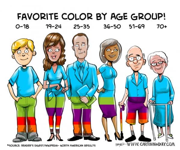
According to the famous study, blue is the most popular among people of all ages and genders. However, the situation slightly changes when we analyze each gender group separately.
In the case of female participants, the study showed the following results:
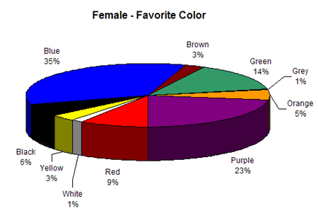
- Blue (35%)
- Purple (23%)
- Green (14%)
- Red (9%)
Ladies obviously don’t like white and grey, while yellow and brown are rated only a couple of percentage points higher than these two colors.
On the other hand, male participants answered like this:
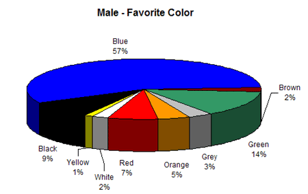
- Blue (57%)
- Green (14%)
- Black (9%)
- Red (7%)
Men apparently love blue, but there are certain differences in terms of other favorite hues. What they have in common with ladies is the fact that men also don’t like white, yellow, grey, and brown.
However, the results get more interesting when we compare color preferences and age groups. In this case, it is important to highlight a few notable findings:
- Older people almost exclusively prefer white and blue, not showing enthusiasm for any other color.
- Young people (aged 19 to 24) are more likely to experiment with different colors, so they show enthusiasm for alternative colors such as brown, black, and green.
- Middle-aged individuals enjoy purple hues, adoring its royal and luxurious appearance.
What is interesting to notice is that almost every age group and gender considers brown and orange to be the least eye-pleasing colors.
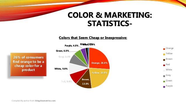
The research obviously shows the highest level of consistency on the opposite ends of the color preference spectrum. While blue and green are dominant in terms of popularity, the negative attitudes are reserved for brown and orange.
Cultural Variations in Color Meanings and Preferences
With everything we’ve seen so far, it is reasonable to conclude that the psychology of colors reveals a lot of rules and regularities. There are many laws on how to combine different hues, while colors, in general, have their own special meanings. We also pointed out the usual color preferences.
However, the situation is not so unanimous after all. There are tons of variations in terms of color connotations and differences between various cultures.
First of all, we should say that color perceptions are individual and subjective, but there is much more than that. Color meanings differ from culture to culture depending on the history and the overall social background.
For instance, Eskimos spend their entire lives surrounded by snow, so they have 17 ways to describe white hues.

White represents innocence and purity in the Western World, but in Japan, it symbolizes death and mourning.

The same goes for red – this color has traditionally been a symbol of passion and energy, but many African cultures believe it’s a color of death and grief.
Green is the most loved color in the Islamic world, while in China it often suggests marital issues.
There are all sorts of variations to consider in this field, which is why marketers invest a lot of time into market research and try to identify color variables that make the biggest impact on the target audience.
The Best Call to Action (CTA) Button Color
Calls to action (CTAs) are a critical marketing tool because they invite website users to take action. However, a CTA has to be highly visible in order to grab the reader’s attention.

Call-to-action button test – red vs green (Source: Hubspot)
Needless to say, colors play a major role in making a high-converting call to action. The goal is to use colors and whitespace around CTAs to maximize the contrast between this element and website background.
Which Call to Action Color Performs Best?
Hubspot conducted research to identify which color performs better – green or red. They learned that red outperforms green by more than 20% in the case where all other on-page components remain the same.
Of course, this doesn’t mean that red always generates better results than green (or any other color for that matter). This depends on the other colors on the page, as well as the target audience.
However, this proves that color psychology influences CTA buttons as well, so you absolutely cannot take your colors for granted if you want to increase your conversion rates.
Conclusion
There is nothing random about colors in marketing. Colors make a strong impression on consumers and often influence purchasing decisions, so they need to be analyzed and carefully selected to match the needs and preferences of the target audience.
In this article, we showed you the basic elements of color psychology:
- The definition and theoretical background
- Meanings of colors
- Gender and age preferences
- Cultural differences in color perception
- Call to action (CTA) button color theory
We hope these tips help you analyze brands and products from a brand new perspective, so you can pay attention to their color psychology and take inspiration from it when designing your own brand identity.
Perhaps next time you’re launching your own blog or creating your own online course, you’ll take into account the psychology of colors and how they might have an impact on your marketing success!
Lauren Adley is a writer and editor at UK BestEssays. She is dedicated to her family, work and friends. She is keen on reading, playing the guitar and traveling. She is interested in educational, marketing and blogging issues.
Disclosure: We may earn commissions if you buy via links on our website. Commissions don’t affect our opinions or evaluations. We’re also an independent affiliate of many platforms, including ClickFunnels, Kartra, GoHighLevel, Podia, Northwest Registered Agent, and others. We’re not employees of these services. We receive referral payments from them, and the opinions expressed here are our own and are not official statements of these companies.
